
peach ai Version 1.0
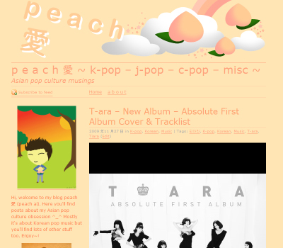
This is peach ai’s first layout. It was made with Photoshop and created around January 2009. It’s quite a dark layout, despite there not being any dark shades. I think it was because of the coloured background and coloured text. I liked the composition though. Actually, I think it might have worked better as a bigger design piece, a wallpaper or poster for example. I really loved this layout for a while though.
But I started to notice the drawbacks of such a layout. It didn’t feel so clean. As I’ve learnt to be a blogger and not a web designer, I’ve realised that most people prefer a clean, clutter free layout that is easy to read (myself included). Thus I decided that this layout was too selfish on my part and I wanted to design something else.
peach ai Version 2.0
This was the last version of when the blog was entitled Peach Ai – unfortunately I don’t have a screenshot for this! However, I did really like this design. It was a lot more simple, a lot cleaner and user-friendly. I definitely think this layout was reflective of my design ethos – clean! Mostly I am inspired by geometric shapes, clean colours and natural forms.
K-Pop Peach – Version 1.0
This heralds quite a big change for my blog. Firstly it brings in a new name, secondly it completely changes the design. This is mostly based on a free WordPress theme but I intend to develop different banners etc. I’m also pleased with the new logo I have designed. K-Pop Peach hwaiting!


Leave a comment